
Appearance and branding in Mstnd: the system in your organization's colors and logo
In this article
The «Appearance and branding» settings in Mstnd give the system interface your organization's identity. You choose the primary color from suggested colors or by typing a color code, add an optional secondary color, see the effect of your choice immediately in a «Live preview» of buttons, menus and notifications, and then upload your organization's logo. The system adjusts text contrast automatically, so text stays easy to read whatever the color.
Quick overview
| Item | Details |
|---|---|
| Module | Settings |
| Where it is in the interface | «Settings» → «Appearance and branding» → the «System identity» card |
| Direct link | https://app.mstnd.sa/settings/theme |
| Goal | Apply the organization's visual identity to the entire system interface |
| Who it is for | The system administrator, and the marketing or corporate communication department responsible for the visual identity |
| Video length | About 29 seconds |
| What you will learn | Choosing the primary and secondary colors, reading the live preview, understanding the contrast adjustment, saving, and uploading the logo |
Watch the video
In about 29 seconds, the video shows choosing the primary color and previewing it, the contrast adjustment and the secondary color, then saving and the «System logo» section.
Why this feature?
The system your employees spend their day in is part of their work environment. When it carries the organization's colors and logo, users feel they are inside the organization's own tool, not a generic program. This makes the system easier to adopt, especially in large organizations that care about a consistent identity at every point of contact.
But customizing colors has its risks. A very light color makes white text unreadable, and a poorly chosen color weakens the visibility of important buttons. That is why this page does not just change the color: it shows the effect before you save and adjusts the text contrast automatically.
| Before customizing the branding | After customizing the branding |
|---|---|
| An interface in generic colors that do not reflect the organization | An interface in the organization's primary color and logo |
| Trying a color means applying it and then reverting | The «Live preview» shows the effect before you save |
| The risk of picking a color that makes text harder to read | Automatic contrast adjustment according to the accessibility standard |
| Emails with an identity separate from the system | Email templates use the same system colors and logo |
Value for the organization: a consistent identity across the system and its messages. Value for the user: a familiar interface that is easy to read.
Where to find it
- Open «Settings».
- Choose «Appearance and branding».
- The «System identity» card appears with the description «Customize the colors and overall look of the system», and next to it the «Live preview».
Direct link: https://app.mstnd.sa/settings/theme
Concepts and terms
| Term | Meaning in Mstnd |
|---|---|
| Primary system color | The main color that appears in the side menus, the primary buttons and the interactive elements |
| Secondary color | An optional color that complements the primary color |
| Color code (HEX) | A code that starts with the # sign and defines the color precisely, such as the code approved in your organization's brand guidelines |
| Suggested colors | A set of ready-made colors you can choose from with one click |
| Live preview | The «How the system will look» panel, which immediately shows the elements in the chosen color |
| Contrast | The difference between the text color and the background color; it is the basis of readable text |
| System logo | Your organization's logo that appears in the system interface |
Step by step
Step 1: Choose the primary system color
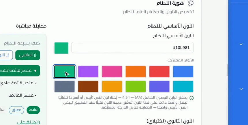
The «Primary system color» section offers two ways to choose:
- From «Suggested colors»: a grid of twelve ready-made colors; click one and it is applied in the preview.
- By color code: type a HEX code in the field, such as the color code approved in your organization's brand guidelines.
Next to the field, a swatch shows the current color, so you can check visually that the code is correct.
Step 2: Review the «Live preview»
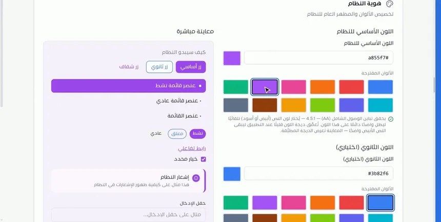
Next to the color selection is the «Live preview» panel, titled «How the system will look». It updates immediately with every change and shows samples of the main interface elements:
- Buttons: «Primary button», «Secondary button» and «Transparent button».
- Menu items: an active item and regular items.
- Status badges, such as «Active» and «Pending».
- An «Interactive link» and a «Selected option».
- The «System notification» as users will see it.
- The «Input field» and the «Progress indicator».
Try more than one color, and watch the active menu item and the primary button in particular, since they are what users see most.
Step 3: Check the contrast and add a secondary color
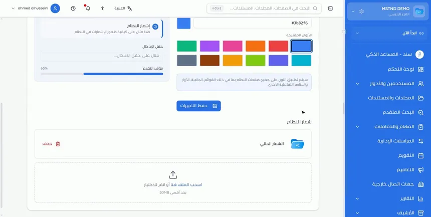
Under the suggested colors, a note explains that the system meets accessibility contrast at level AA, with a ratio of 4.5:1. In practice, this means:
- The text color (white or black) is chosen automatically so that it stays clear on the color you picked.
- The shade of the color may be deepened slightly when it is applied, so that white text stays clear.
- The preview shows the shade that is actually applied, not just the one you typed.
After the primary color comes the «Secondary color (optional)» section, with a color code and suggested colors that work the same way. Use it if your organization's brand guidelines define a complementary color.
Step 4: Save the changes and upload your organization's logo
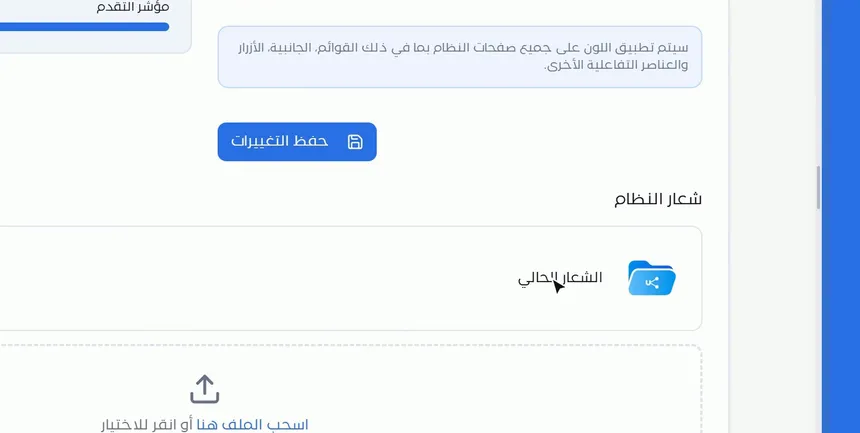
Before the save button, a note says that the color will be applied to all system pages, including the side menus, the buttons and the other interactive elements. Click «Save changes» to apply it.
Then move to the «System logo» section at the bottom of the page:
- It shows the «Current logo» with a «Delete» button.
- Upload your organization's logo by dragging the file to the designated area, or by clicking the area to choose it from your device. The maximum file size is shown under the area.
After that, the system carries your organization's color and logo. Email identity uses the same colors and logo in the email templates.
Options and their effect
| Option or setting | What it does | When to use it |
|---|---|---|
| «Suggested colors» (primary) | Applies a ready-made color with one click | For a quick trial, or when there are no brand guidelines |
| Primary color code | Defines the color precisely with a HEX code | When the brand guidelines have an approved color |
| «Live preview» | Shows the effect of the color on the interface elements | Before every save |
| Automatic contrast adjustment | Chooses the text color and deepens the shade when needed | Works automatically with any color you choose |
| «Secondary color (optional)» | Adds a complementary color | If the brand guidelines define a secondary color |
| «Save changes» | Applies the colors to all system pages | After reviewing the preview |
| Logo upload | Puts your organization's logo in the system | At the first setup, or when updating the logo |
| «Delete» (current logo) | Removes the current logo | When replacing it or changing the identity |
Practical scenarios
Scenario: A trading company applies its brand guidelines
Situation: A company has visual identity guidelines with a defined primary color and secondary color, and wants the system to reflect them.
What you do in Mstnd:
- Type the primary color code from the brand guidelines.
- Type the secondary color code in «Secondary color (optional)».
- Review the «Live preview», then click «Save changes».
- Upload the logo in «System logo».
Result: The system interface is consistent with the company's website and printed materials, and the emails carry the same identity.
Scenario: A government entity that cares about accessibility
Situation: A government entity uses a relatively light color in its identity and worries that it will make text harder to read.
What you do in Mstnd:
- Type the approved color code.
- Review the contrast note and the applied shade in the preview.
- Check that the «Primary button» and the «Active menu item» are clear in the preview.
- Save the changes.
Result: The entity's identity is present in the system, with clear text for all users according to the accessibility standard.
Scenario: A school group makes its system recognizable
Situation: A group of private schools wants teachers and administrative staff to recognize its system easily.
What you do in Mstnd:
- Choose the group's color from the suggestions or by its code.
- Upload the group's logo.
- Save, then set up Email identity so that notifications arrive in the group's name.
Result: A unified experience in the group's identity, from the screen to the inbox.
Scenario: A contracting company updates its branding after a name change
Situation: The company has launched a new identity with a different logo and color.
What you do in Mstnd:
- Delete the «Current logo» and upload the new logo.
- Update the primary color with the new code and save.
- Update the name from the Organization page if it has changed.
Result: The system moves to the new identity on the very day it is launched.
How it relates to other features
- Email identity: the system colors and logo set here are used in the email templates the system sends.
- Organization: the organization's name and official details; together with the logo and colors, they complete how the organization is represented in the system.
- Smart watermark: another side of the organization's identity, this time on the documents themselves, to protect them from leaks.
- Date and time: another general setting that you set once and that affects how the system displays information for all users.
- Dashboard: the first screen users see, where the effect of the primary color shows on the cards and buttons.
Tips and best practices
- Use the official color code from the brand guidelines, not a color close to it.
- Review the «Live preview» carefully, especially the primary button and the active menu item.
- Trust the automatic contrast adjustment, and do not try to get around it with a lighter color.
- Add the secondary color only if it is truly part of your identity; simplicity is clearer.
- Upload a good-quality logo with a suitable background so that it appears clearly in the interface.
- Set up the branding before inviting users, so that their first impression of the system carries the organization's identity.
- Set up Email identity right after the colors and logo, so that the identity is complete in the messages too.
Warnings and common mistakes
FAQ
How do I change the Mstnd system color to my organization's color?
Open «Settings» → «Appearance and branding», choose a color from «Suggested colors» or type the color code, then click «Save changes».
Can I use a specific color code?
Yes. Type a HEX code in the «Primary system color» field to apply the color precisely.
How do I upload my organization's logo in Mstnd?
In the «System logo» section at the bottom of the appearance and branding page, drag the logo file to the upload area or click the area to choose it.
Why does the applied color look slightly darker than the color I chose?
Because the system deepens the shade slightly when needed, so that white text stays clear according to accessibility contrast at level AA, and the preview shows the applied shade.
Is the secondary color mandatory?
No. The «Secondary color» is optional; add it if it is part of your organization's identity.
Is the color applied to all system pages?
Yes. After you save, the color is applied to all system pages, including the side menus, the buttons and the interactive elements.
Do the colors and logo appear in emails?
Yes. Email identity uses the system colors and logo set here in the email templates.
How can I see what the color looks like before applying it?
In the «Live preview» panel, which immediately shows the buttons, menus, notifications and other elements in the chosen color.
Summary
- «Appearance and branding» gives the Mstnd interface your organization's colors and logo.
- Choose the primary color from the suggestions or by color code, and add a secondary color when needed.
- The «Live preview» shows the effect on buttons, menus and notifications before you save.
- The system adjusts text contrast automatically according to the accessibility standard.
- The colors and logo extend to the email templates through Email identity.
Try it free: Create your organization's account in Mstnd
Was this article helpful?
Related articles
 0:43
Email identity in Mstnd: send system notifications in your organization's name
Set up Mstnd email identity so notifications use your organization's name and email: sender identity, SMTP, secure connection, test email, notification types.
 0:21
Organization settings in Mstnd: your organization's official data in one place
Learn Mstnd organization settings: name, type, commercial registration and tax number, how to edit and save them, and why the unique identifier is display-only.
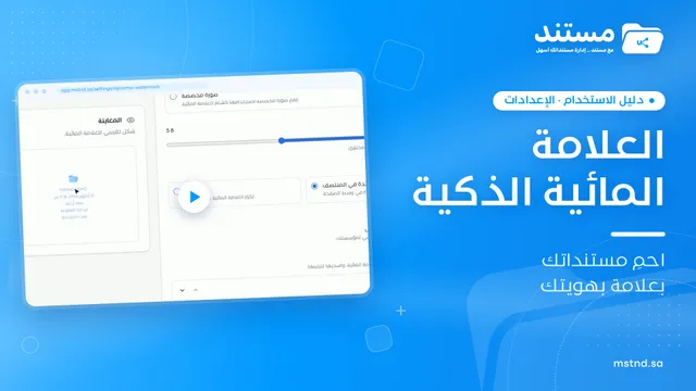 1:28
The smart watermark in Mstnd: protect your documents with your brand identity
Design a smart watermark with your logo, user details and date, set when and where Mstnd adds it to documents and correspondence, plus a confidentiality mark.
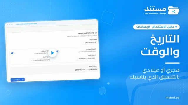 0:25
Date and time settings in Mstnd: Hijri, Gregorian or both
Learn Mstnd date and time settings: choose the 24-hour or 12-hour clock, enable Gregorian, Hijri or both dates, and format each one with an instant preview.
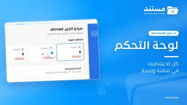 1:57
The Mstnd Dashboard: everything waiting for you on one screen
Learn the Mstnd Dashboard: the «Waiting for you today» cards, the Action agenda, workflows, Sanad recommendations, team activity and how to plan your day.